
Overview
Reliance Jio set out to build India’s largest Mixed Reality ecosystem with its subsidiary - JioTesseract, where I worked as a UX designer for XR Platform and First party applications. As part of this vision, we developed JioGlass, India’s first commercial Mixed Reality (MR) glasses, and a content marketplace for immersive experiences. The JioGlass App served as the companion app, managing all underlying services and APIs required for the hardware’s functionality.
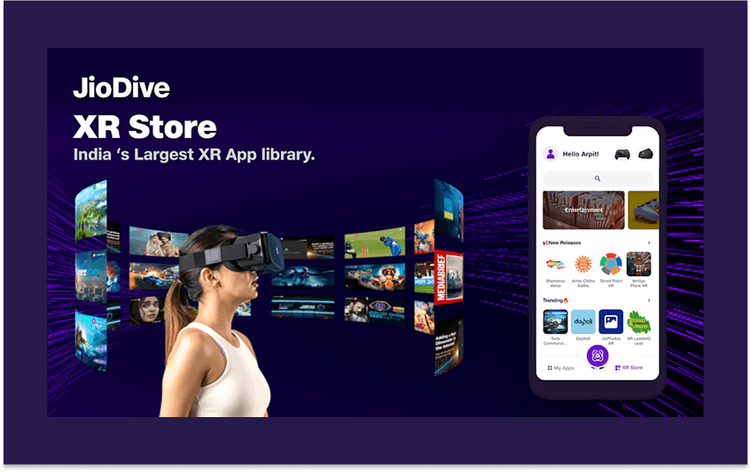
In Phase 2 of this vision, the ecosystem expanded to include JioDive, a VR headset that relied on smartphone-based rendering. This required adapting the companion app to support both devices under a unified platform, rebranded as JioImmerse.
As the lead UX designer, I drove the end-to-end design process for both phases, ensuring seamless user experiences across devices while addressing complex technical and usability challenges. My approach was deeply user-centric, iterative, and collaborative, blending research, creativity, and technical understanding to deliver impactful solutions.
JioImmerse (B2C App)
Android App Link | iOS App Link
Tesseract Portal (B2B version of JioImmerse)
Android App link
Phase 1: JioGlass Companion App (B2B and exploratory B2C)
The Challenge
The goal was to create a companion app that would:
Simplify the setup of a complex MR device for first-time users.
Introduce users to mixed reality in an intuitive and engaging way.
Provide seamless access to MR applications and content.
But here’s the catch: Mixed Reality was a new concept for most Indian users, and the hardware itself had multiple components that could confuse even tech-savvy individuals. The challenge wasn’t just designing an app—it was designing an entire onboarding experience that would make MR accessible and exciting.
My Approach: A User-Centric, Iterative Process
Understanding the Landscape:
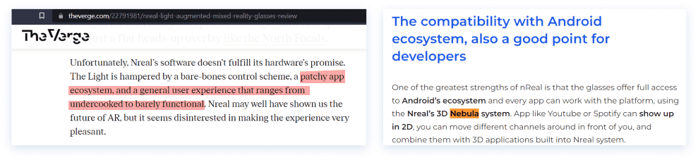
I started by diving deep into the competitive landscape, analyzing global players like Oculus, Magic Leap, and Nreal. I wanted to understand how they onboarded users, delivered content, and handled challenges like unfamiliar hardware.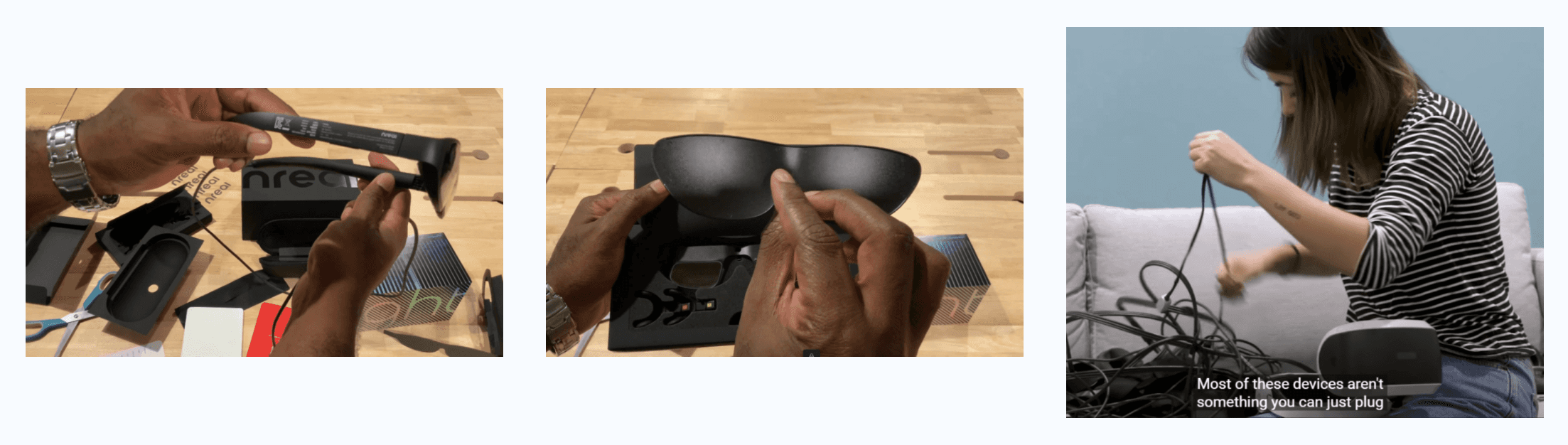
Key Insight: Most competitors struggled with onboarding. Users often felt overwhelmed by the setup process, which dampened their excitement.
Listening to Users (Even Without Direct Access):
Since we didn’t have access to real users early on, I turned to online reviews and unboxing videos of similar devices. I watched how users interacted with the hardware, where they got stuck, and what frustrated them.
Key Insight: Users often struggled with pairing controllers and assembling the device. Many gave up halfway through the setup process.
Internal Testing to Simulate Real Users:
To validate our assumptions, I conducted internal usability testing with team members unfamiliar with the project. I gave them tasks like setting up the device and installing apps, observing their struggles and successes.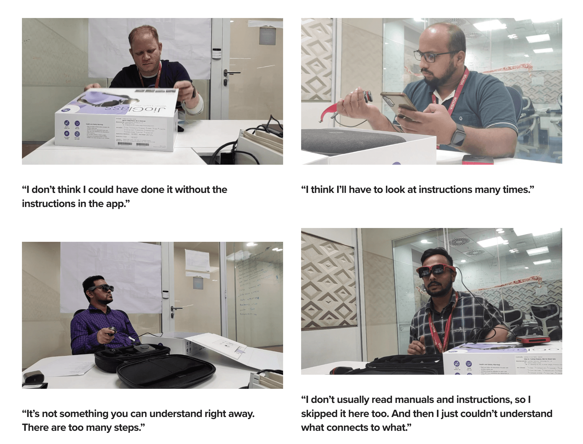
Key Insight: Even tech-savvy team members struggled with certain steps, like pairing the controller. This highlighted the need for clear, step-by-step guidance.
Defining the Solution:
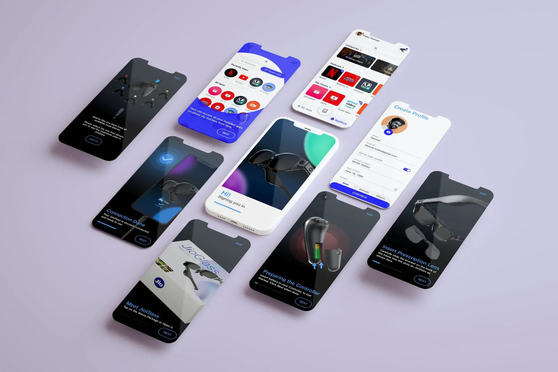
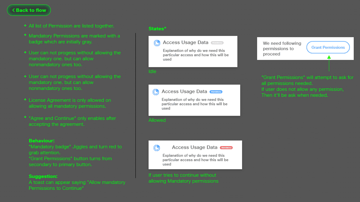
Based on the research, I proposed a companion app that would act as a one-stop solution for everything a user might need:Guided Setup: Step-by-step instructions with visuals and animations.
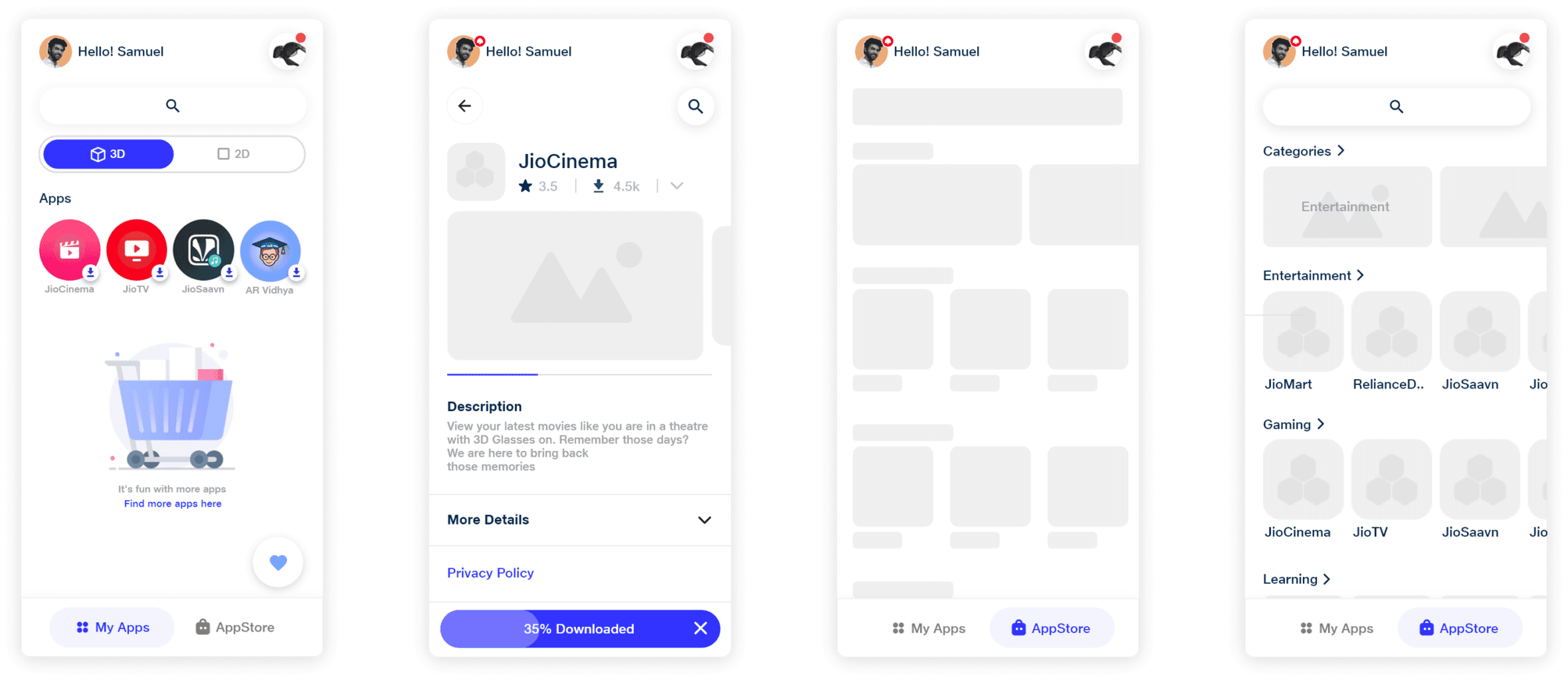
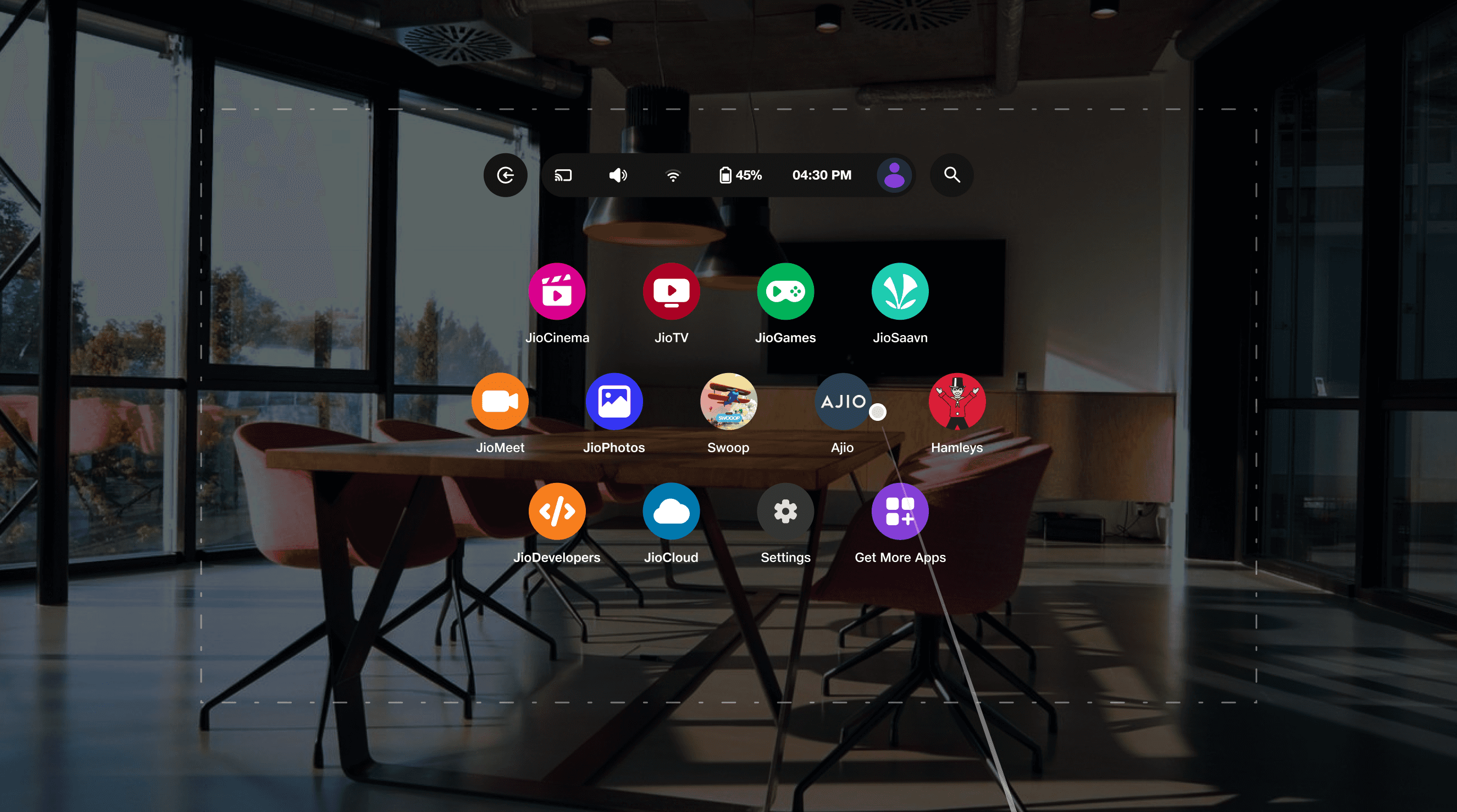
Dual App Drawer: Separate sections for MR and native mobile apps.
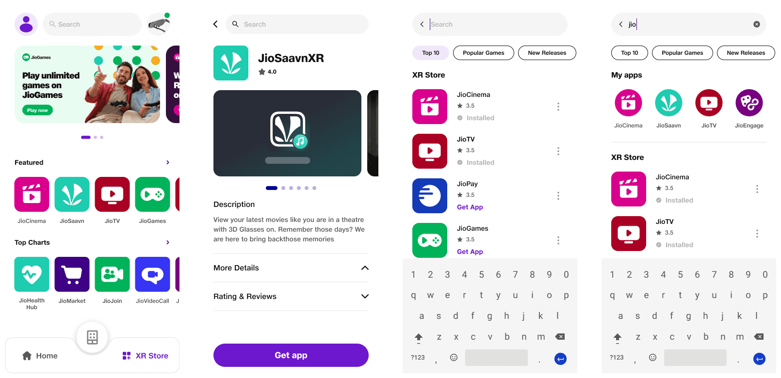
Integrated App Store: Seamless access to MR content without leaving the app.
Help & Support: Easy access to troubleshooting guides and tutorials.
Simplifying the Hardware Experience:
The hardware itself was complex, with multiple components to assemble. I worked closely with the hardware team to optimize the assembly process, identifying the most intuitive sequence and creating clear instructions.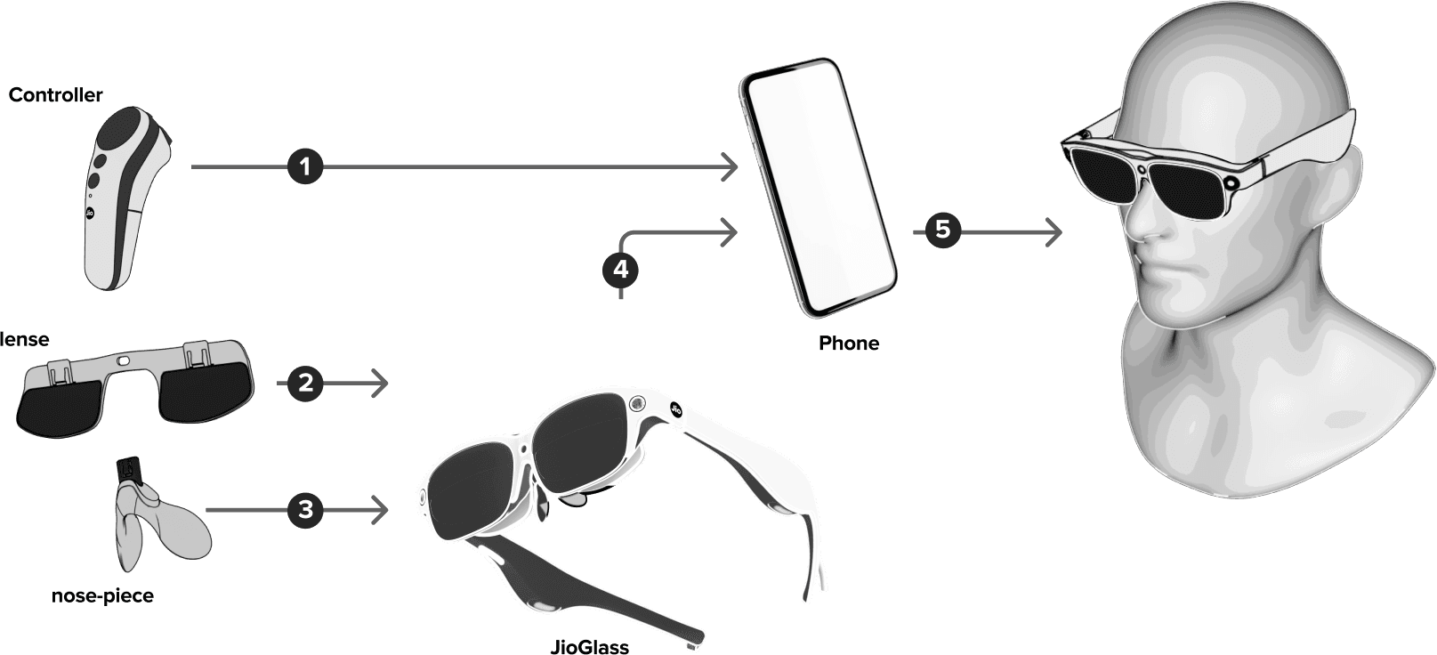
Key Insight: The controller was the most problematic component. While the hardware team worked on a long-term fix, I designed clear visual cues in the app to guide users through pairing and setup.
Iterative Design & Testing:
So this one was different than what I normally used to. in this case, we had to define user flows all the way starting from unboxing to assembly then to using the device and finally shutting down and storing it in the case. This was exhaustive and had to go through many iterations.

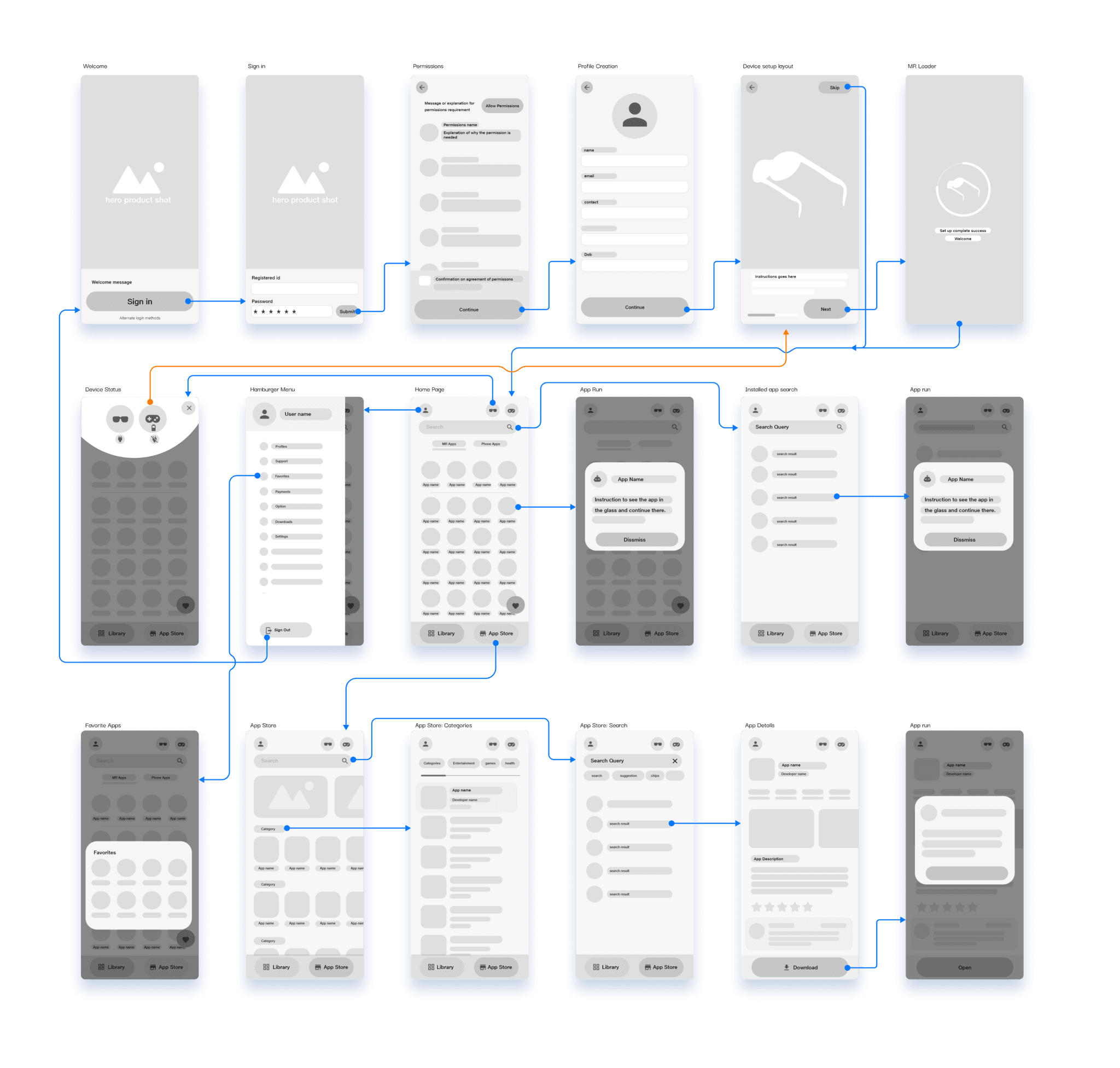
Then I moved on to the Information Architecture. I always begin design only after defining its information architecture. It helps me and stakeholders understand how different aspects of the app relate to each other. I like finding and defining clear hierarchies. At this stage, I involve the head of engineering to ensure the design and engineering architecture are as similar as possible. I approach making information architecture as a site map too.

Once there was clarity and agreement on features, flows, and architecture, it was time for wireframes. While wireframing, I had two goals:
Making sure to cover all major happy flows.
This was essential to develop an MVP that we can use to perform some user testing as soon as possible.Use as familiar UX patterns as possible.
For good adoption and retention rate. Designing any novel interactions or flows could lead to user dropoffs.
Wireframes
Building a Scalable Design System:
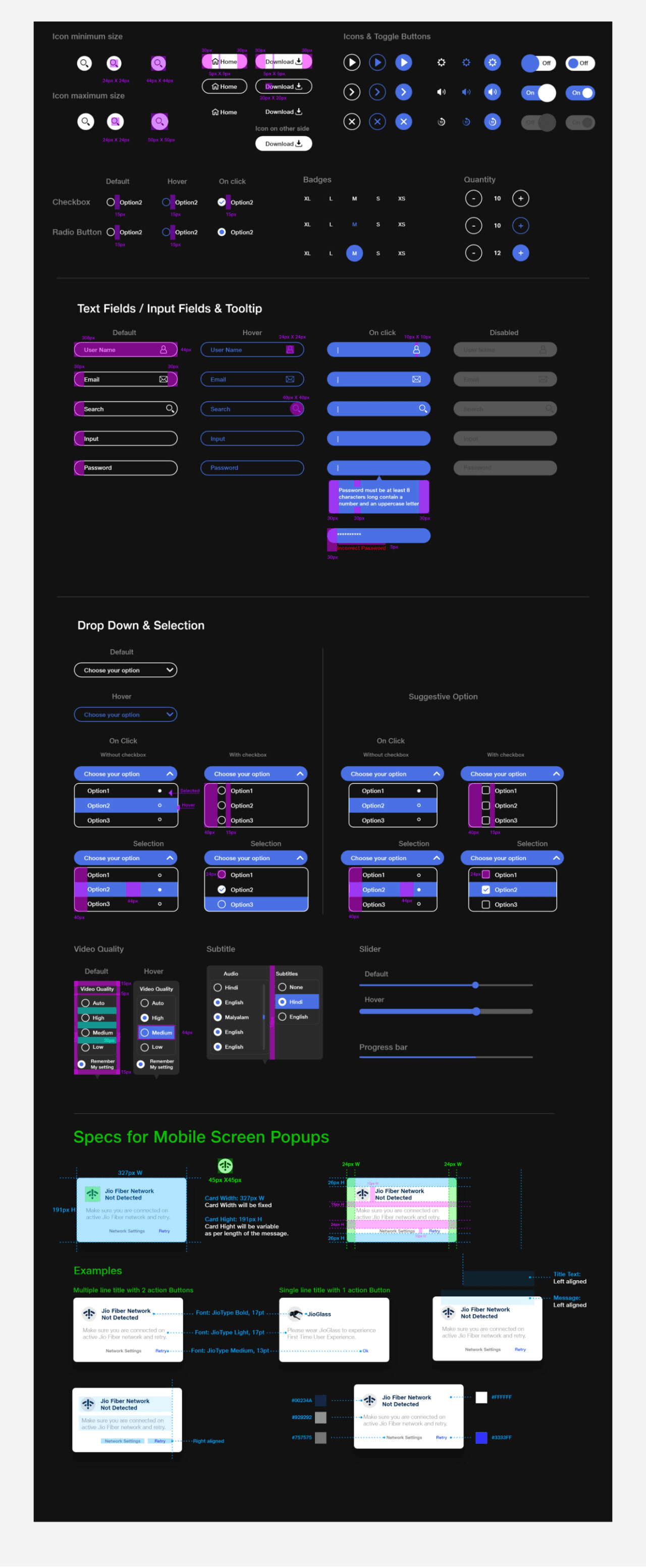
Knowing this would be a long-term project, the team established an adhoc design system using the atomic design method. This ensured consistency across screens and made it easier to scale the app as new features were added. This was because Jio's design system was undergoing an overhaul and we kept iterating our design system based on the updates on Jio's foundation principles.
Typography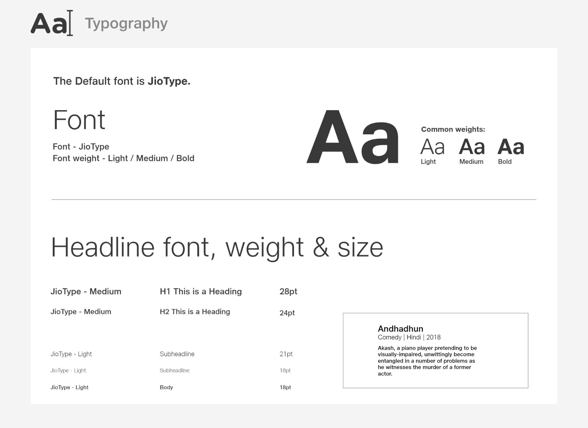

Colour Styles and Core components
Icons and Illustrations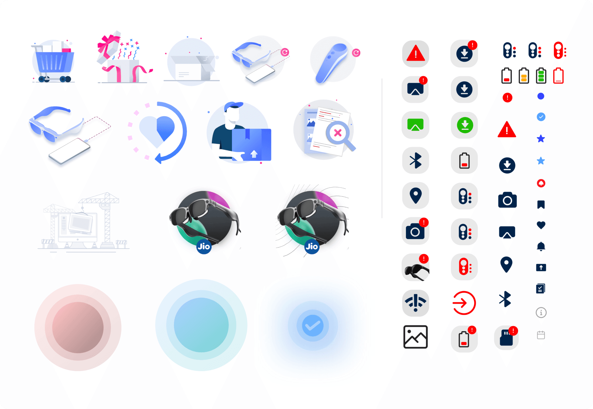
High Fidelity Designs:
Armed with the style guide, I started the visual design process. Initially, I just focused on happy flows.Onboarding screens


Home screen

AppStore screens

Once they were done I moved on to loading states, empty states, negative flows, and error pop-ups.Empty states
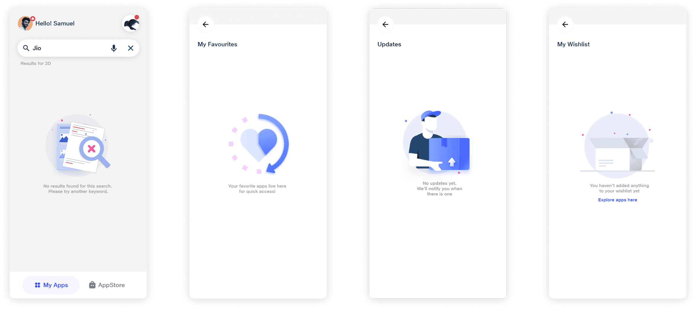
Negative flows and Error pop ups


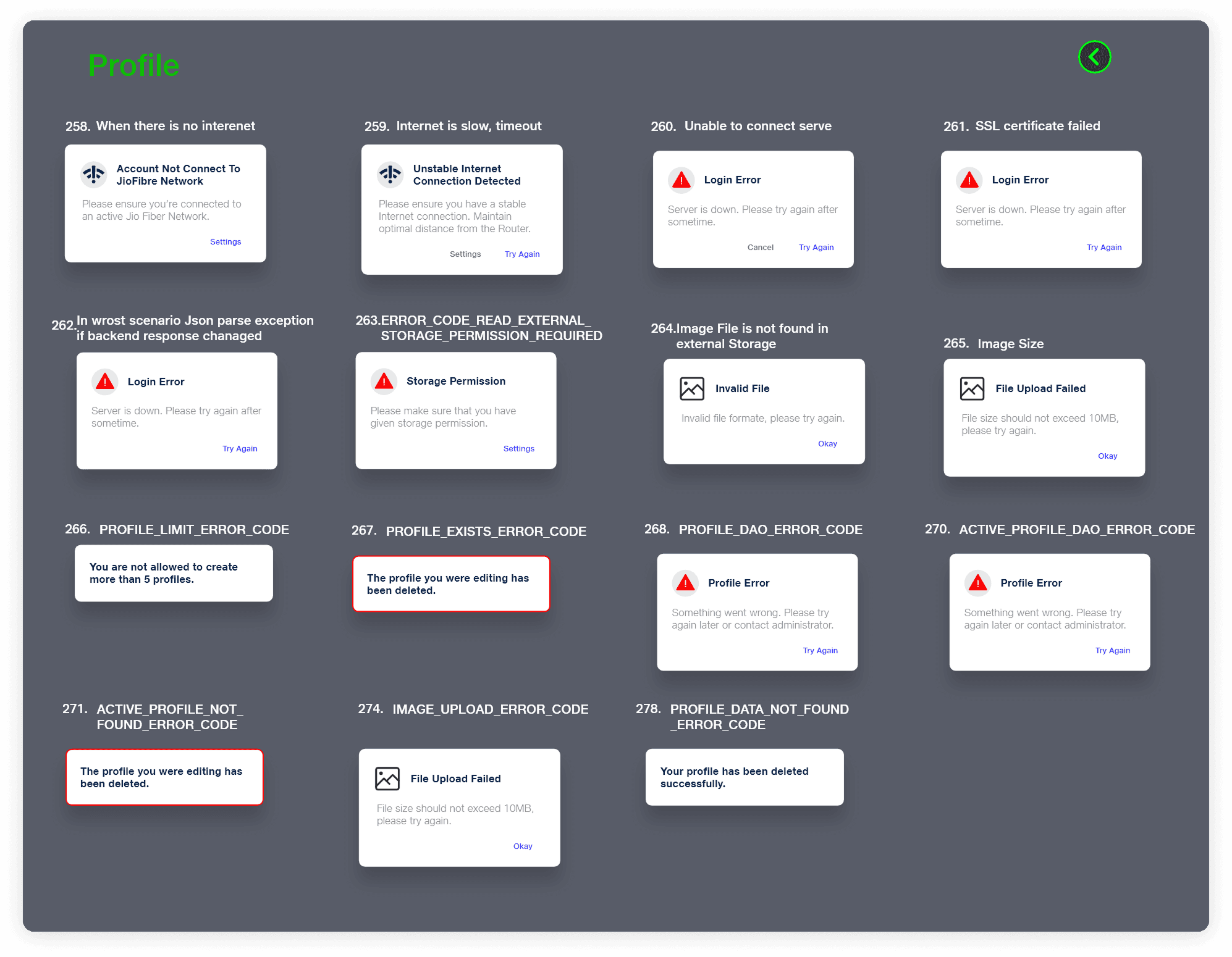

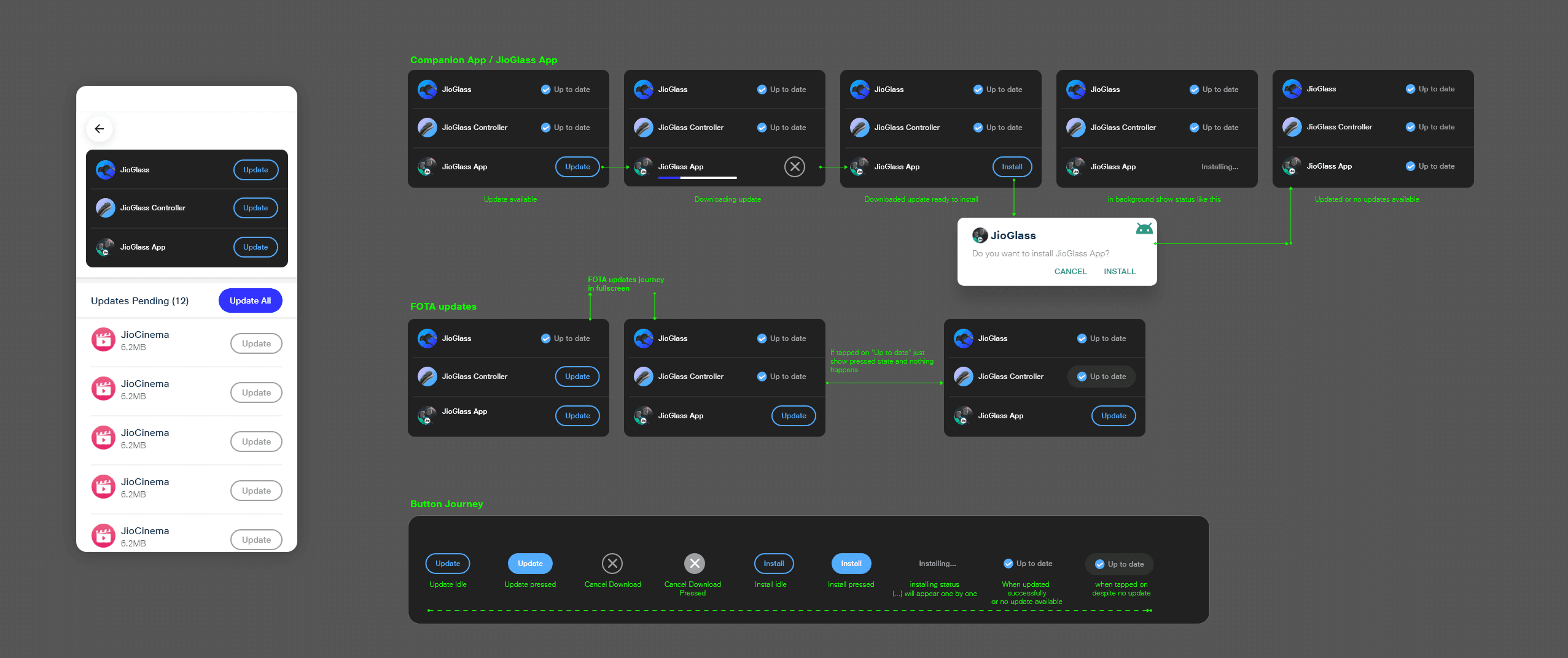
Handoff & Collaboration:
I worked closely with developers to ensure a smooth handoff. I created interactive prototypes in Adobe XD and provided detailed documentation to guide implementation. Please see the excerpts of the document below.
Impact
Delivered the MVP, enabling user trials and stakeholder demonstrations.
Secured additional funding from Reliance Jio for further development.
Established a robust design system across all touchpoints (app, hardware, packaging, marketing).
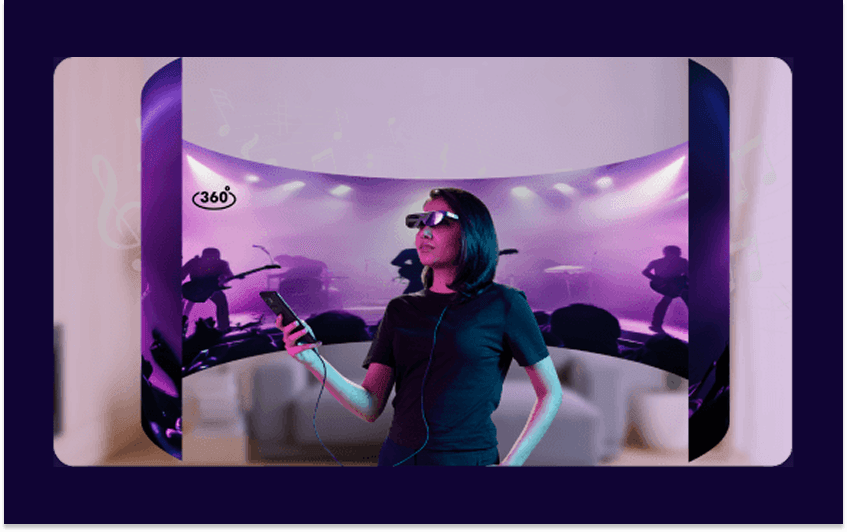
Phase 2: JioDive and Rebranding and shift to JioImmerse (B2C)
The New Challenge
With the success of JioGlass, the next step was to expand the ecosystem to include JioDive, a VR headset that relied on smartphone-based rendering. This meant adapting the companion app to support both devices under a unified platform, rebranded as JioImmerse.
The challenge was multifaceted:
Technical Complexity: The app needed to handle VR rendering directly on the phone, which could lead to performance issues like overheating, lag, and battery drain.
User Experience: We had to ensure a seamless experience for users switching between MR (JioGlass) and VR (JioDive) modes, while maintaining consistency across the ecosystem.
Rebranding: The app needed a new visual identity to reflect the unified platform, requiring a redesign of the UI and design system.
My Approach: Tackling Challenges Head-On
Understanding the Technical Constraints:
Challenge: Smartphone-based VR rendering is resource-intensive. Early tests showed that the app caused phones to overheat, lag, or drain battery quickly, especially on mid-range devices.
Solution: I collaborated closely with developers to implement performance optimization features, such as:
Device Compatibility Checks: The app would detect the phone’s specs and adjust rendering settings accordingly, without any user intervention
Battery-Saving Modes: Users could enable a low-power mode to reduce performance strain.
Clear Feedback Mechanisms: The app would alert users if their phone was overheating or running low on battery, with suggestions to pause or close resource-heavy apps.
Rebranding to JioImmerse:
Challenge: The rebranding wasn’t just about a new name—it required a complete overhaul of the app’s visual identity to reflect the unified platform. But we saw an opportunity here. And at the same time Jio had just updated their brand guidelines and design foundations, which helped us align closer to the parent brand.
Solution: I led the redesign of the app’s UI, ensuring consistency across all touchpoints.
I updated the design system to include new branding elements, and we took this opportunity to move all our designs to Figma, for faster design iterations and better developer hand-offs.
We created foundation principles and design tokens, which were created as a library for Android and iOS ecosystems
I also introduced custom illustrations and a happier visual language to make the app more engaging and visually appealing.
The team created a new app icon and more pleasing grap
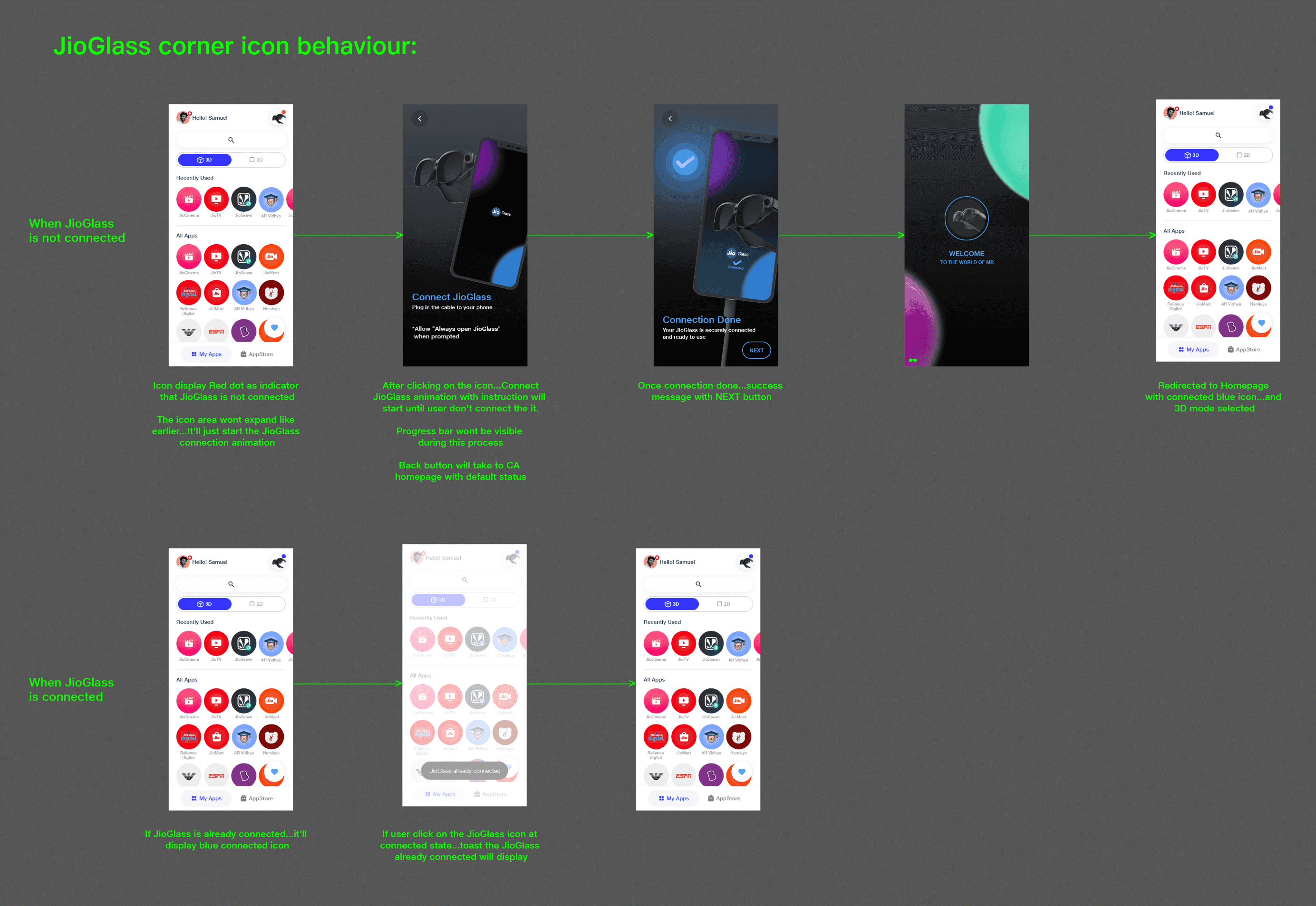
Designing for Dual Devices:
Challenge: The app needed to support both JioGlass (MR) and JioDive (VR) without confusing users. Each device had unique setup processes, content requirements, and interaction patterns.
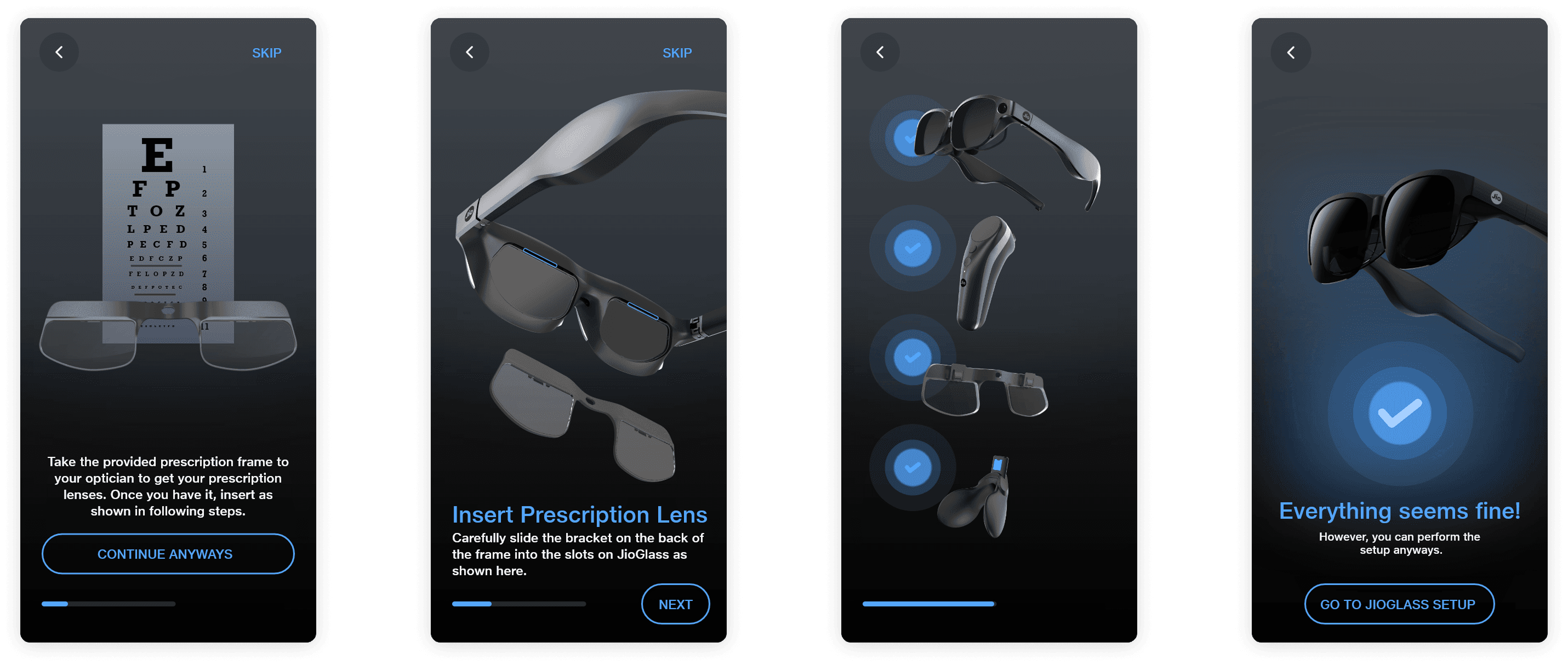
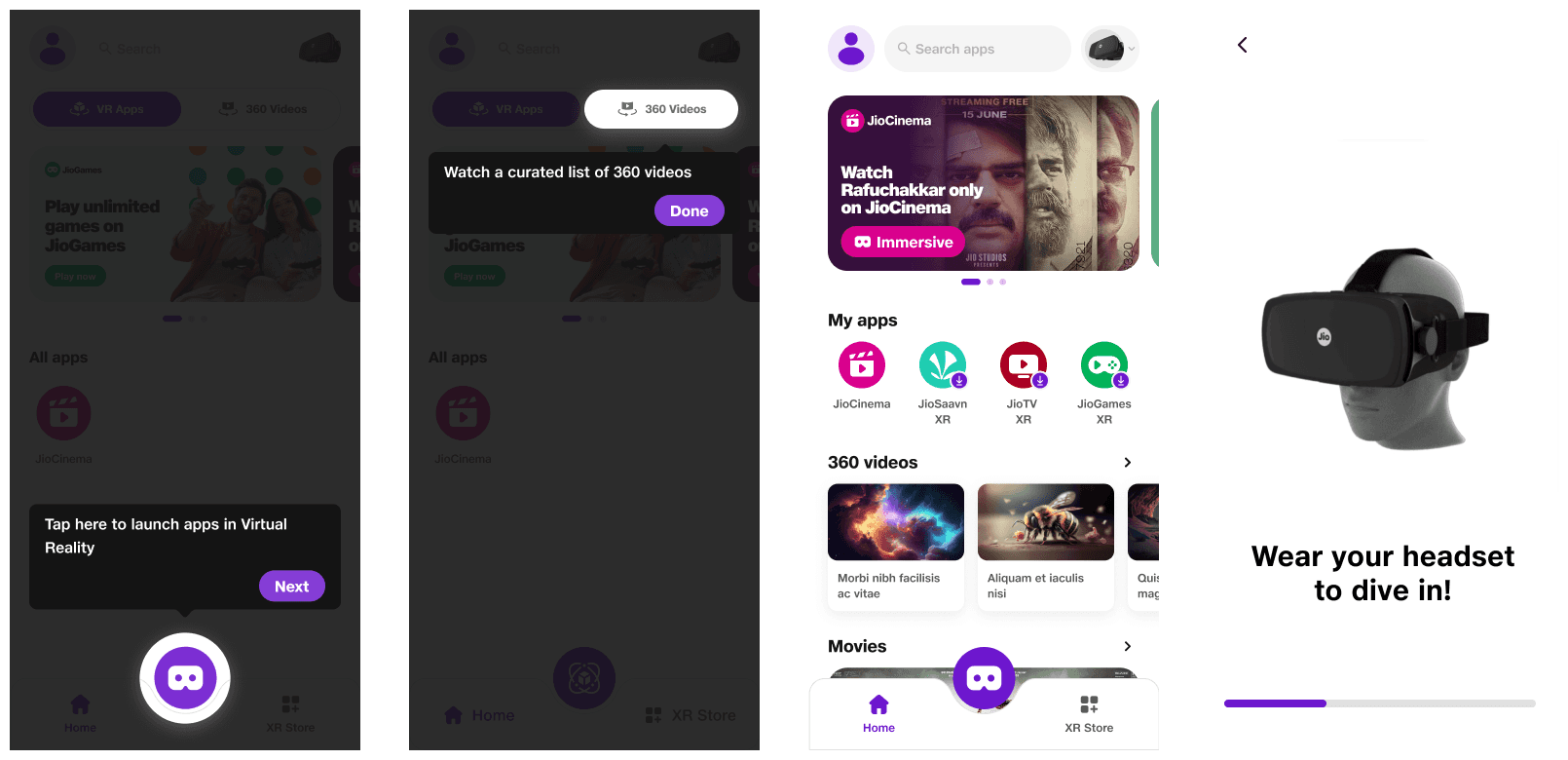
Solution: I designed a unified onboarding flow that allowed users to select their device (JioGlass or JioDive) at the start. The app dynamically adapted based on the selected device, providing tailored instructions and content.
For example, JioGlass users were guided through controller pairing, while JioDive users were shown how to insert their phone into the headset.
I also created a dual app drawer that separated MR and VR apps, making it easy for users to find the right content for their device.
Login (Common for both devices):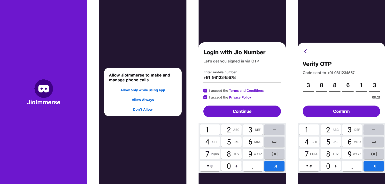
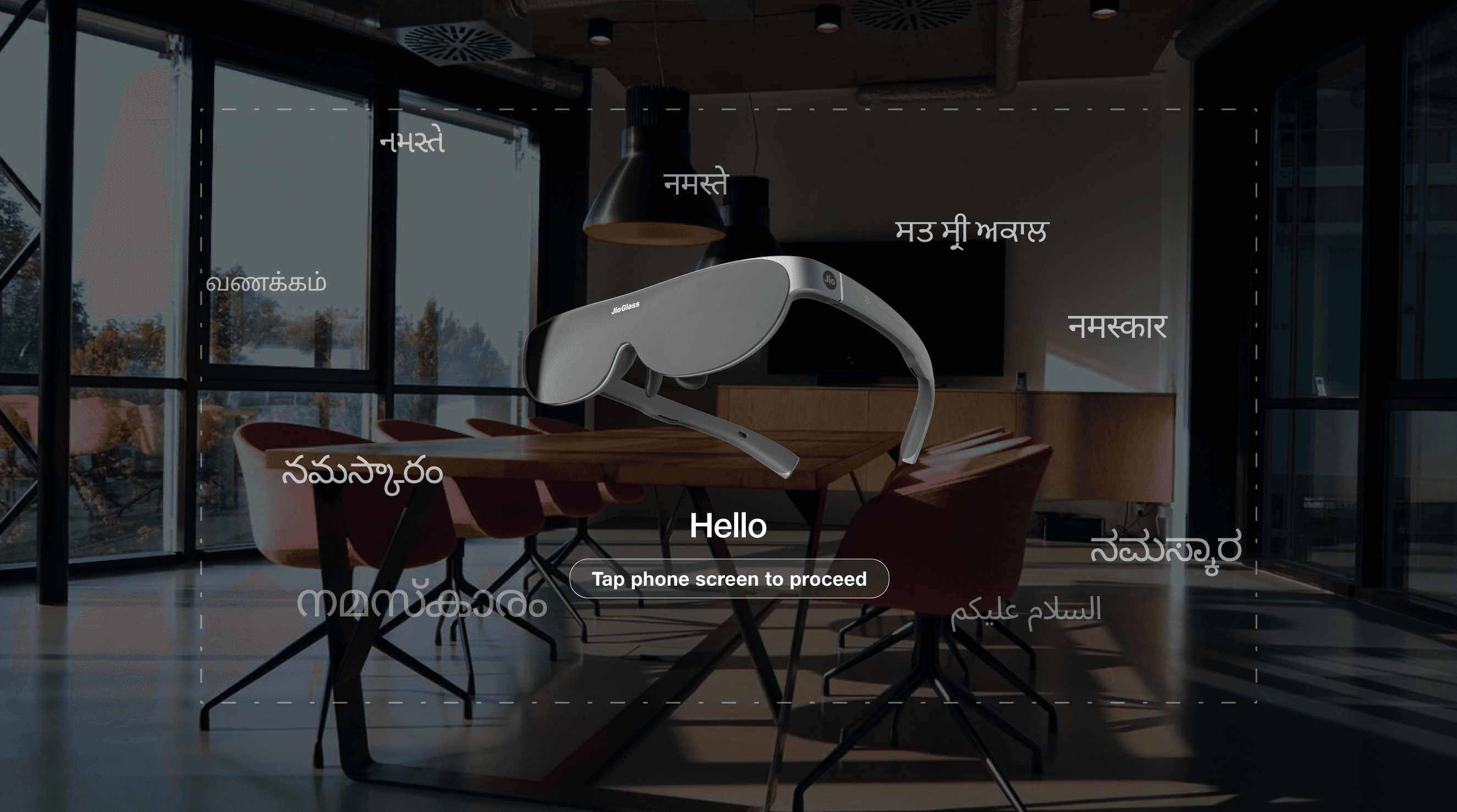
Onboarding for JioGlass:


Onboarding for JioDive:

Handling Content Fragmentation and improving discoverability:
Challenge: MR and VR content were stored in separate libraries, making it difficult for users to discover new experiences.
Solution: The device selection is made separately and each device has its own version of the home screen and appstore environments. We also made our SDK for developers in a way that they can use the same build to be compatible for both JioGlass and JioDive. And the same project can be used to make builds for both Android and iOS, as the interaction libraries were made to work for all scenarios.

Testing & Iteration:
Challenge: With so many new features and changes, there was a risk of introducing usability issues or bugs. And we had planned to launch the B2C app to the public during IPL(Indian Premier League) 2023, which was a challenge.
Solution: I conducted beta tests with 200 user. We were crunched on time so we gave away the JioDive devices for free to 200 random people by setting up a stall outside our office. The beta tests started one month before the real launch, and we used the WPL (Women's Premier Leage) for our beta tests to test with users in the exact same conditions as the actual launch.
Challenges I Faced during beta testsand How I Overcame Them
Challenge: Overheating and Performance Issues
Problem: During early testing, users reported that their phones overheated or lagged when using JioDive.
Solution 1: I worked with developers to implement performance optimization features, such as device compatibility checks and battery-saving modes. I also designed clear feedback mechanisms to alert users if their phone was overheating or running low on battery.
Solution 2: I worked on optimizing the token and component libraries for Android, iOS and Unity (for XR apps). Using lightweight components, converting GIF and WEBM animations to Optimized Lotties, and recreated complex custom components as subtle additions over Material design and iOS default UIKit components for the most optimized components.
Challenge: Maintaining Consistency Across Devices
Problem: With two devices and multiple content libraries, there was a risk of creating a fragmented user experience.
Solution: I created a dual app drawer and an integrated app store that made it easy for users to find the right content for their device. I also updated the design system to ensure consistency across all touchpoints.
Challenge: Tight Deadlines
Problem: The project had a tight deadline, with only 8 weeks to deliver the MVP.
Solution: I prioritized features based on user needs and technical feasibility, focusing on the most critical flows first. I also worked closely with the team to streamline the design and development process, ensuring we met the deadline without compromising on quality.
Impact
Successfully unified JioGlass and JioDive under the JioImmerse platform, creating a cohesive ecosystem.
The app currently has over 500k users across Android and iOS
Had a average MAU of over 63% from March 2023 to January 2024
Delivered a seamless user experience for both MR and VR devices, enhancing accessibility and usability.
Strengthened the brand identity with a consistent design system and visual language.


